Marriage and Divorce in Turkey - Marriage
I was initially going to make this only one post but I realized that there is actually a lot of material to analyze and visualize so I decided to divide this post into two parts. Just like any marriage, part 1 of this series will focus on marriage and part 2 on divorce. I will not write much as the plots speak for themselves, I tried to include some more statistical analysis. Drop me a line if you have any questions or suggestions!
library(tidyverse)
library(reshape2)
library(plyr)
library(stringr)
library(scales)
library(knitr)
library(data.table)
library(sp)
library(rgeos)
library(mgsub)
library(gridExtra)
library(ggrepel)
library(lmtest)
library(pander)
library(MASS)
library(lindia)
Regional Differences
tr_to_en <- function(datafile){
  turkish_letters <- c("Ç","Ş","Ğ","İ","Ü","Ö","ç","ş","ğ","ı","ü","ö")
  english_letters <- c("C","S","G","I","U","O","c","s","g","i","u","o")
  datafile <- mgsub(datafile,turkish_letters,english_letters)
  return(datafile)
}

#Set-up the map

tur <- readRDS("../data/TR/TUR_adm1.rds")

cities <- tur@data[,c("NAME_1", "ID_1")]
colnames(cities)[2]<- "id"
cities[,2] <- as.character(cities[,2])
tur <- gSimplify(tur, tol=0.01, topologyPreserve=TRUE)
tur <- fortify(tur)

map <- left_join(tur, cities, by = "id")

map$NAME_1 <- tr_to_en(map$NAME_1)
map$NAME_1 <- gsub("K. Maras", "Kahramanmaras", map$NAME_1)
map$NAME_1 <- gsub("Kinkkale","Kirikkale", map$NAME_1)
map$NAME_1 <- gsub("Zinguldak", "Zonguldak", map$NAME_1)
map$NAME_1 <- gsub("Afyon","Afyonkarahisar", map$NAME_1)

colnames(map)[8] <- "City"
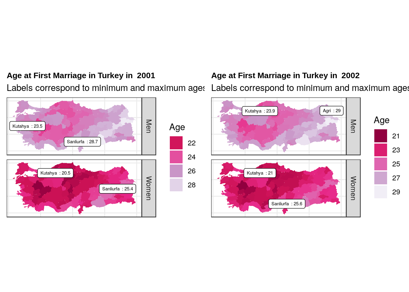
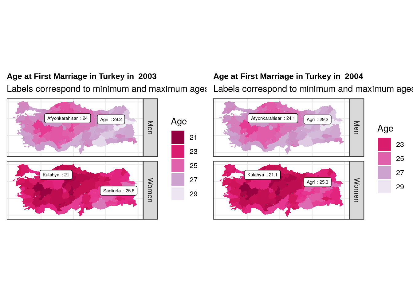
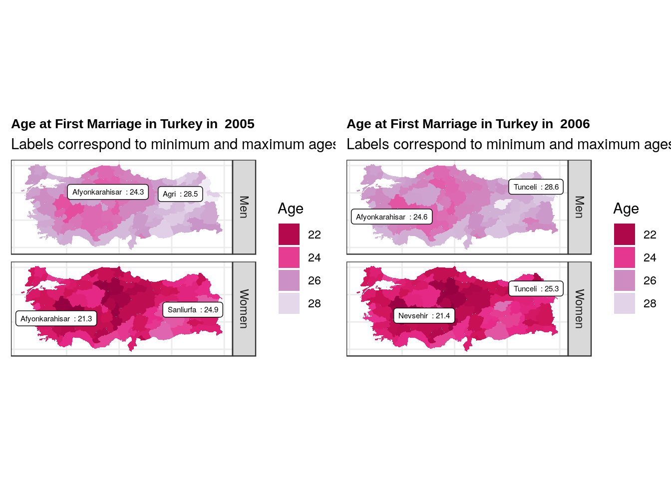
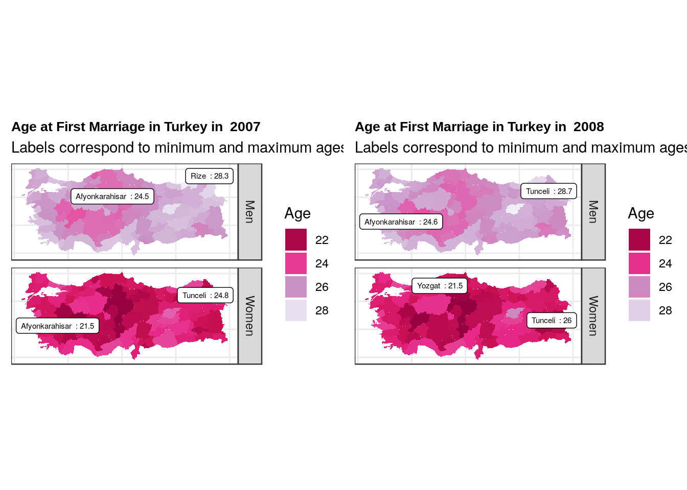
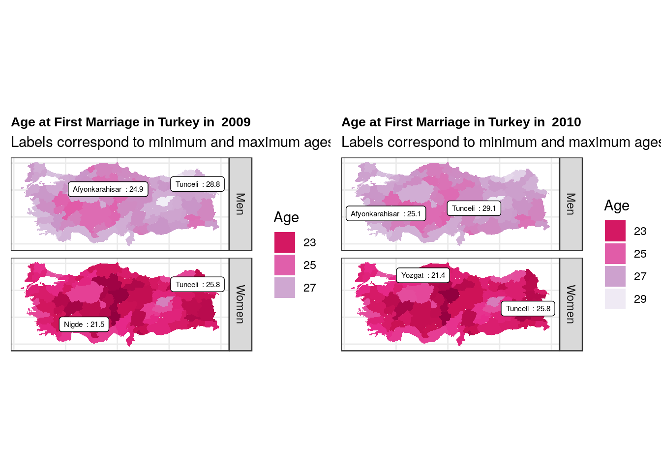
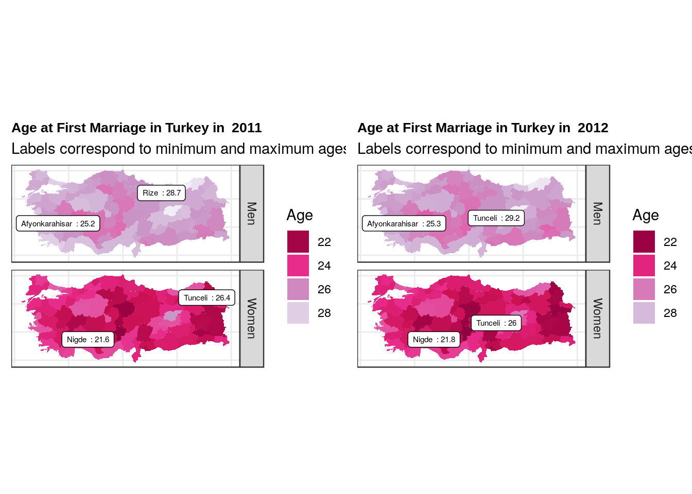
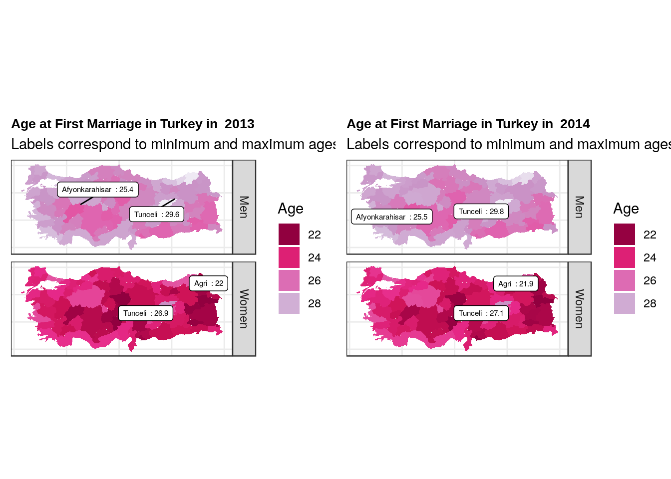
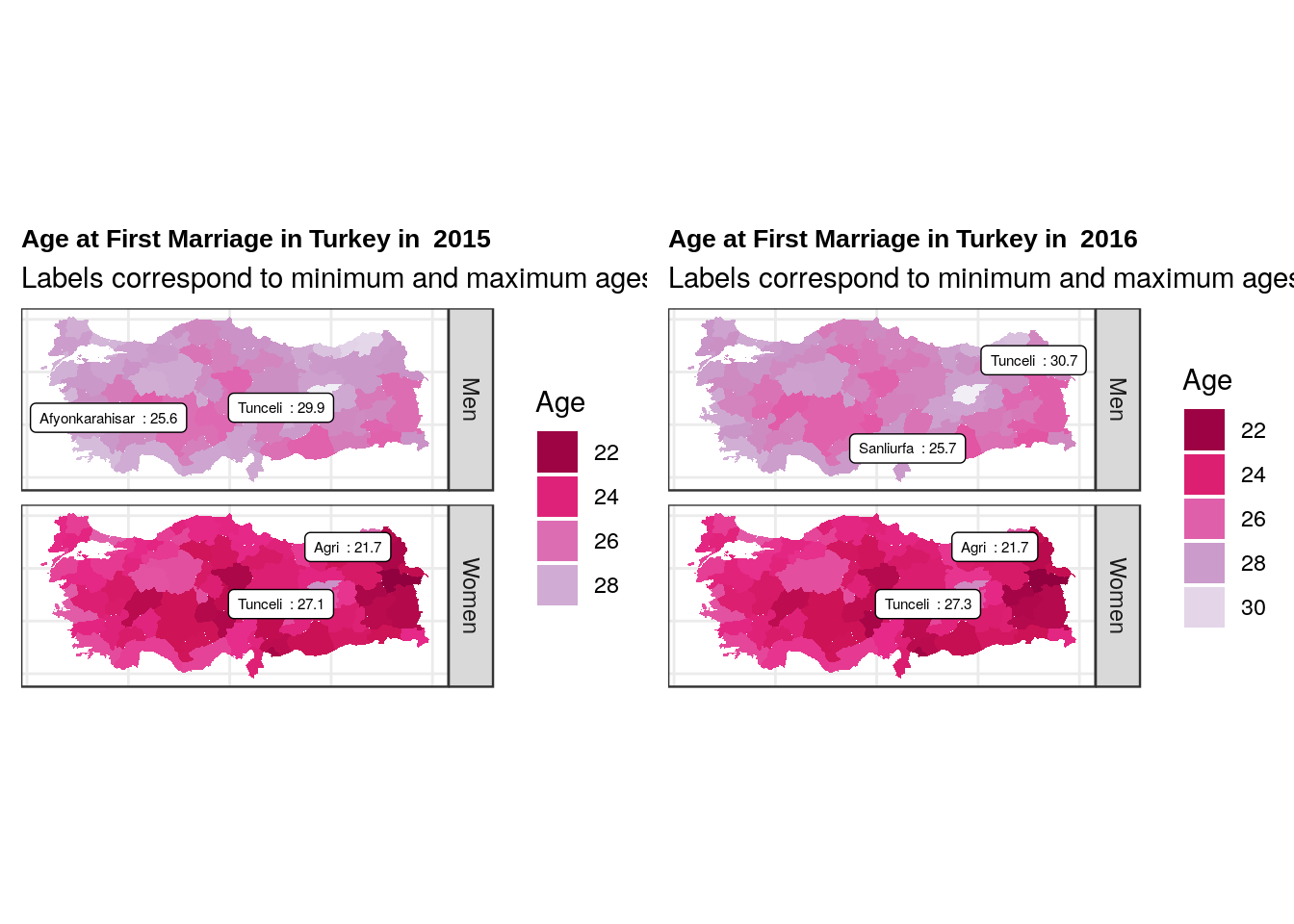
It seems like residents of Tunceli (both men and women) get married the oldest amongst all Turks. On the other hand, it seems like the women of Agri get married earlier than the rest of the female population. Funnily that is not the case for the men of Agri which says a lot about the mariage dynamics (age difference between bride and groom, this will become more apparent in the second part of this series when I study age differences at the time of divorce).
mariageAge <- fread("../data/TR/Ortalama ilk evlenme Yasi.csv")


colnames(mariageAge) <- c("Gender", "Year", "Adana", "Adiyaman", "Afyonkarahisar", "Aksaray", "Amasya", "Ankara", "Antalya", "Ardahan", "Artvin", "Aydin", "Agri", "Balikesir", "Bartin", "Batman", "Bayburt", "Bilecik", "Bingol", "Bitlis", "Bolu", "Burdur", "Bursa", "Denizli", "Diyarbakir", "Duzce", "Edirne", "Elazig", "Erzincan", "Erzurum", "Eskisehir", "Gaziantep", "Giresun", "Gumushane", "Hakkari", "Hatay", "Isparta", "Igdir", "Kahramanmaras", "Karabuk", "Karaman", "Kars", "Kastamonu", "Kayseri", "Kilis", "Kocaeli", "Konya", "Kutahya", "Kirklareli", "Kirikkale", "Kirsehir", "Malatya", "Manisa", "Mardin", "Mersin", "Mugla", "Mus", "Nevsehir", "Nigde", "Ordu", "Osmaniye", "Rize", "Sakarya", "Samsun", "Siirt", "Sinop", "Sivas", "Tekirdag", "Tokat", "Trabzon", "Tunceli", "Usak", "Van", "Yalova", "Yozgat", "Zonguldak", "Canakkale", "Cankiri", "Corum", "Istanbul", "Izmir", "Sanliurfa", "Sirnak")


mariageAge <- melt(mariageAge, id.vars = 1:2 , variable.name = "City")

data <- left_join(map, mariageAge, by = "City")
## Warning: Column `City` joining character vector and factor, coercing into
## character vectorageYear <- function(year) {
yearData <- data[data$Year == year,]
min.women <- yearData[yearData$Gender == "Women",][which.min(yearData[yearData$Gender == "Women",]$value),]
min.men <- yearData[yearData$Gender == "Men",][which.min(yearData[yearData$Gender == "Men",]$value),]
max.women <- yearData[yearData$Gender == "Women",][which.max(yearData[yearData$Gender == "Women",]$value),]
max.men <- yearData[yearData$Gender == "Men",][which.max(yearData[yearData$Gender == "Men",]$value),]
ageMap <- ggplot(data = yearData) +
geom_polygon(aes(x= long, y =lat, group = group, fill = value)) +
guides(fill = guide_legend(title = "Age")) +
theme(legend.box.margin = margin(c(1,10,1,1))) +
scale_fill_distiller(palette = 11, direction = -1 ) +
facet_grid(Gender~.) + coord_fixed(1.3) + theme_bw() +
theme(axis.line=element_blank(),axis.text.x=element_blank(),
axis.text.y=element_blank(),axis.ticks=element_blank(),
axis.title.x=element_blank(),
axis.title.y=element_blank(),
panel.grid.minor=element_blank(),
plot.title = element_text( family = "Arial", face = "bold", size = 10 )) +
ggtitle(paste("Age at First Marriage in Turkey in ", year), subtitle = "Labels correspond to minimum and maximum ages") + geom_label_repel(data = rbind(min.men,min.women, max.men, max.women), aes(x = long, y = lat, label = paste(City, " :", value)), size = 2)
return(ageMap)
}
for (i in seq(2001,2016,2) ){
grid.arrange(ageYear(i), ageYear(i+1), ncol = 2)
}
ageYear(2017)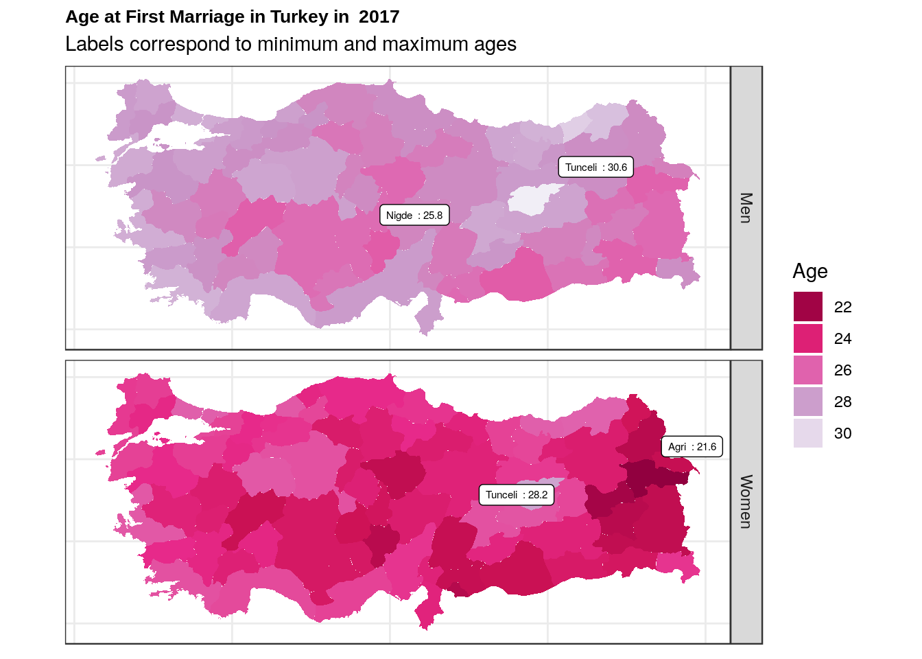
National Differences and Trends
The images seem to suggest that women get married way earlier than man, not a really suprising result but just for fun let’s do a two sample t-test:
women <- mariageAge[mariageAge$Gender=="Women",]
men <- mariageAge[mariageAge$Gender=="Men",]

pander(t.test(women$value,men$value), size = 8)| Test statistic | df | P value | Alternative hypothesis | mean of x | mean of y |
|---|---|---|---|---|---|
| -82.44 | 2752 | 0 * * * | two.sided | 23.3 | 26.63 |
As we can see the difference between men’s and women’s age for their first mariage is statistically significant despite the low sample size. Let’s also use the Box-Cox test to see if a quadratic fit is really correct for women:
gg_boxcox(fitted.lm = lm(women$value~poly(women$Year,2)),scale.factor = 1, showlambda = T) + geom_vline(xintercept = 2, color = "red") + ggtitle("Box-Cox Likelihood Test", subtitle = "We find the minimum of the negative log-likelihood function") + theme_bw() +
          theme(plot.title = element_text( family = "Arial", face = "bold", size = 10 ))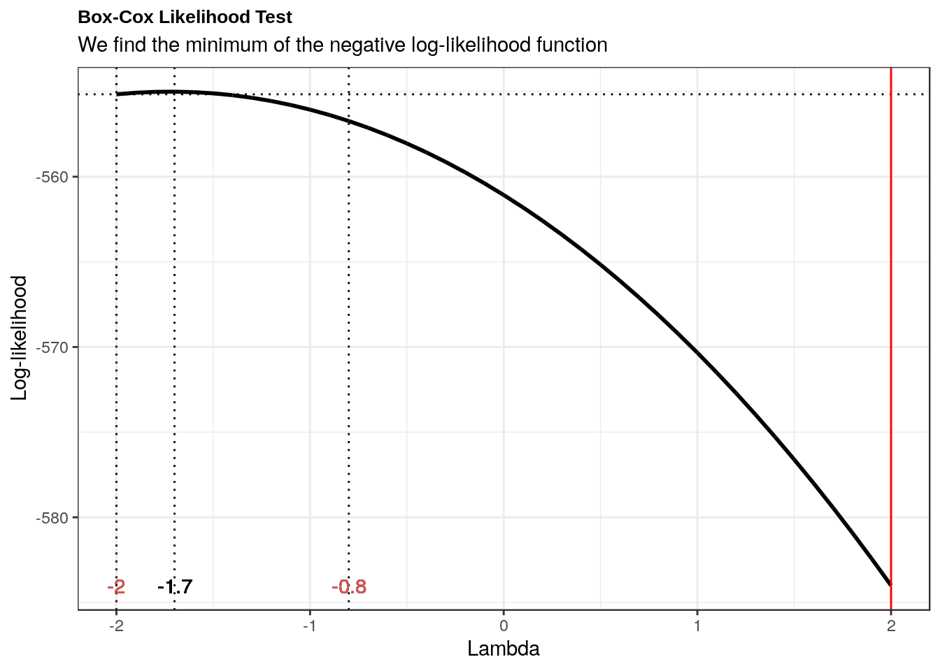
Indeed, we see that a quadratic degree is more likely.
If the trend for women goes this way in about a decade or so women will catch up with men (although I highly doubt the trend will continue.):
Note: The model fit for men is a simple linear model.
ggplot(data = men) + geom_point(aes(x = Year, y = value), stat = "summary", fun.y = "mean") + geom_smooth(data = men,aes(x = Year, y = value), method = "lm", fill = NA) + guides(fill = F) + ggtitle("Women are getting married earlier but their mean age of marriage is \nincreasing quadratically") + theme(plot.title = element_text(hjust = 0.5)) + theme_minimal() + facet_grid(.~Gender) + geom_point(data = women, aes(x = Year, y = value), stat = "summary", fun.y = "mean") + geom_smooth(data = women,aes(x = Year, y = value), method = "lm", formula = y ~ poly(x,2), fill = NA) + theme(plot.title = element_text(family = "Arial", face = "bold")) + ylab("Age")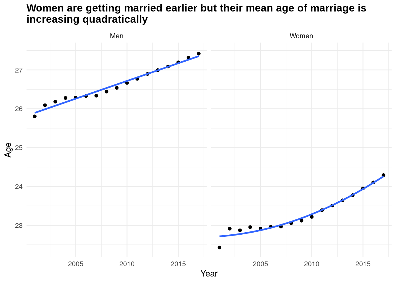
x <- 2001:2040

year <- men$Year
model.men <-  lm(men$value~year)
pred.men <- predict(model.men, newdata = data.frame(year = x))

year <- women$Year
model.women <- lm(women$value~poly(year,2))
pred.women <- predict(model.women, newdata = data.frame(year = x))

data <- tibble("Year" = x, "Men"= pred.men, "Women " = pred.women)
data <- melt(data, id.vars = 1, value.name = "Value")
## Warning in melt(data, id.vars = 1, value.name = "Value"): The melt generic in
## data.table has been passed a tbl_df and will attempt to redirect to the relevant
## reshape2 method; please note that reshape2 is deprecated, and this redirection
## is now deprecated as well. To continue using melt methods from reshape2 while
## both libraries are attached, e.g. melt.list, you can prepend the namespace like
## reshape2::melt(data). In the next version, this warning will become an error.colnames(data)[2] <- "Gender"
data <- data.table(data)
data <- data[, mean(Value), c("Year", "Gender")]
colnames(data)[3] <- "Mean Age"
ggplot(data = data ) + geom_line(aes(x = Year, y = `Mean Age`, color = Gender)) + geom_vline(xintercept = 2035.3, linetype = "dotdash", color = "purple") + ggtitle("First Mariage Age Projection", subtitle = "Women should catch up with men in the first quarter of 2030 ") + theme(plot.title = element_text(hjust = 0.5)) + theme_minimal() +ylab("Age")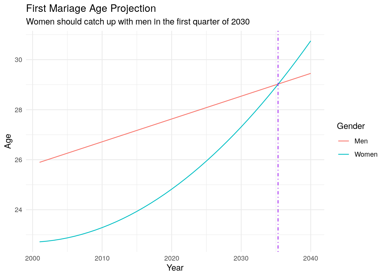
Stay tuned for part 2: Divorce. It will be denser and more interesting as I have more data. I am currently working on it and it should be out in a little while!